Car Accidents n stuff
Find the perfect (or as perfect as possible) print ad and the perfect video ad. Post it on your blog and then turn in the link to the blog. In your blog explain how rhetorical appeals make this ad "perfect."
Apologies in advance for the weird formatting, I have no idea why its all spread apart like that and I don't have the patience to figure it out
Apologies in advance for the weird formatting, I have no idea why its all spread apart like that and I don't have the patience to figure it out
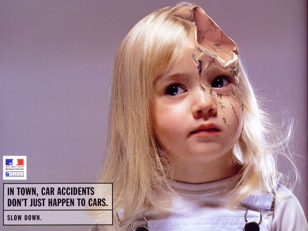
This video ad is related to the print ad above since they both focus on the deaths of children by car accidents. I think what makes this ad powerful is the first 30 seconds giving no hint of danger, instead, looking like another corny advertisement for a car brand. Even if you find the advertisement funny because it’s so cheesy and the CGI is weak, it stays in your head and will be shared around among many different people. Thought the ad lacks in logos and ethos, the pathos is clear and catches your attention.
Overall, neither of these advertisements are perfect, but no ad is, and these come pretty darn close.


Comments
Post a Comment